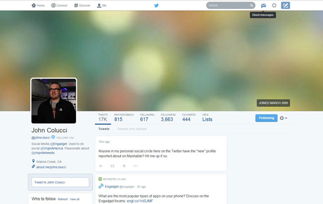
In its continued quest to make its product more accessible to the masses, Twitter has begun testing a comprehensive visual redesign of its profile pages. The new profile pages, as reported by Mashable, feature a big profile picture on the left flanked by a huge, 1500-pixel-wide cover photo with follower counts and tweet counts layered atop it. The tweet stream has been turned into a mosaic-view of tweets. The new profile highlights photo and video tweets, but notably removes any semblance of a chronological vertical “timeline” from the profile. In fact, the new profile looks more like Facebook or Google+, with its emphasis on large, vibrant content cards.
Twitter is known to frequently A / B test features it’s considering launching, so it’s unclear if today’s test will make its way to all users or get canned by Twitter engineers. What we do know is that Twitter is thinking about abandoning the text-based vertical stream layout that made it so famous — for profile pages, at least. The funny part is that Facebook recently ditched its mosaic-view Timelines in favor of vertical streams.
In the wake of Twitter’s first earnings report as a public company where user growth was lower than expected, Twitter is seemingly looking for new ways to engage people who’ve never seen or used the service before. Compared to Facebook, Google+, and Pinterest, Twitter as it exists today looks a bit outdated with its focus on text posts. Twitter power users love the site’s minimalism, but for new users considering signing up (in order to follow a celebrity, for example), quick access to big photos and profile pictures might play a large role. Only recently did Twitter add in-stream photos, which were seen as a way to increase engagement inside the feed.
Source: theverge.com