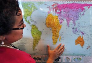
The Peters Projection Map displays the world’s land masses true to size. Photo by JOHN TLUMACKI/GLOBE STAFF.
Boston Public Schools is looking to give its students a more accurate view of the world.
In addition to using the widely popular Mercator projection map, which severely distorts the size of the world’s countries and continents, BPS classrooms will soon incorporate the Peters projection map, as it displays the world’s continents to scale more accurately.
In the Mercator maps, created by Flemish cartographer Gerardus Mercator in 1569 and originally intended for navigation and trade purposes, continents appear grossly warped and larger or smaller than their true sizes. For instance, Alaska is displayed as larger than Mexico, which isn’t accurate, while the nation of Greenland appears gigantic compared to Africa when it’s actually about 14 times smaller than the continent.
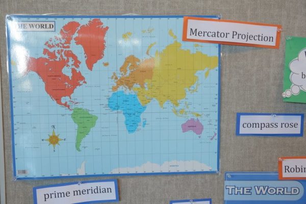
The Mercator projection map. Image courtesy of Boston Public Schools.
The Peters Projection map on the other hand, created by German historian Arno Peters in 1973, gives a more “culturally proficient” view of the world as countries and continents are shown at their true scales. Like any two-dimensional rendering of a three-dimensional globe, however, the Peters projection isn’t free from distortions. The modernized map creates some effects of horizontal warping near the North and South poles, according to the Huffington Post.
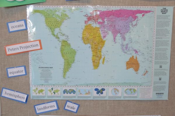
The Peters projection map. Image courtesy of Boston Public Schools.
“By incorporating the Peters projection maps — an equal area representation — into classrooms, we are opening the door for students to view the world in a different light,” BPS’ History and Social Studies Director Natacha Scott told the news site. “Taking the time to analyze different map projections will help facilitate conversations about bias in the classroom, allowing students to become more aware of the world around them.”
According to BPS’ website, the Peters maps will be distributed as part of a resource set to enrich global learning in all second-, seventh-, and 11th-grade classrooms teaching social studies. The school system also will provide teachers with digital resources, such as articles, images and lesson plans that can be used to spark student dialogue and reflection.
Apparent distortions in the Mercator map set Eurocentric cultures near the center of the map while marginalizing or even shrinking other nonwhite cultures in the process. Education experts argue that this warped view of the world affects all students’ global perceptions, but particularly those of nonwhite students.
“Eighty-six percent of our students are students of color,” Hayden Frederick-Clarke, director of cultural proficiency for BPS, told station WBUR. “Maps that they are presented with generally classify the places that they’re from as small and insignificant. It only seems right that we would present them with an accurate view of themselves.”
Colin Rose, assistant superintendent in charge of the Boston Public Schools’ Office of Opportunity and Achievement Gaps, echoed Fredrick-Clarke’s sentiments, saying the district’s efforts to “decolonize the curriculum” was more than about just switching maps.
“It’s about a paradigm shift in our district,” Rose told The Boston Globe. “We’ve had a very fixed view that is very Eurocentric. How do we talk about other viewpoints? This is a great jump-off point.”
The Peters map has already been adopted by the United Nations and Scott said she believes the 125-school district is the first in the U.S. to make the shift. Though the Mercator projections aren’t being removed from classrooms, the social studies director said she’s already witnessed the positive effects of the Peters map on students.
“Some of their reactions were quite funny,” Scott said. “But, it was also amazingly interesting to see them questioning what they thought they knew.”