The 1569 Mercator projection was made for navigating the seas — drawing the meridians and parallels as straight lines that cross at right angles helped sailors to navigate some of their first treacherous voyages around the world.
Mercator initially made globes. Later transferring his map from a three-dimensional curved surface to a flat sheet of paper was problematic. Taking the equator as the logical map center left big, confusing gaps near the poles.
Mercator’s solution was to stretch out the northern and southern extremities of the globe to fill those gaps, producing an elegant and usable map.
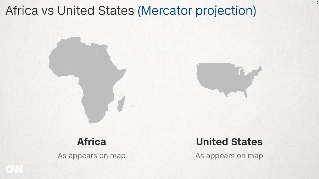
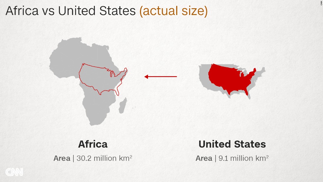
While a revolutionary tool for captains and explorers, the projection distorts the relative size of the continents, to the advantage of the West.
The repercussions of this are still being felt today.
On the Mercator map, Africa — sitting on the equator, reasonably undistorted — is left looking much smaller than it really is. But Canada, Russia, the United States and Europe are greatly enlarged.
The distortion is largest near the poles: Greenland, which looks about the same size as the whole of Africa on the Mercator, is a classic example. In truth, it is no bigger than the Democratic Republic of Congo.
“If you would take a map projection with equal areas then there is almost no space on the map to display all [these details].”
There was, of course, much to map in Africa, too, but that mattered less to the cartographers up north, he adds.
One of the dangers of the Mercator map is that it can make enlarged countries seem unnaturally powerful and intimidating.
“The term ‘power of representation and representation of power’ sums up quite well how maps and the rise of the Western nation-state system — and with that, empire and colonialism — are linked,” says Marianne Franklin, professor of Global Media and Politics at Goldsmiths, University of London.
Was subsequent European imperialism perhaps spurred on by a map projection that reinforced the notions of self-importance held by those nations?
“The world maps that prevail today have been embedded in Western imaginations since the British empire. They continue (to prevail) despite many challenges to their fairness and accuracy because they underpin the ongoing Anglo-Euro-American presumption that the world belongs to them, and pivots around these geo-cultural axes,” Franklin says.